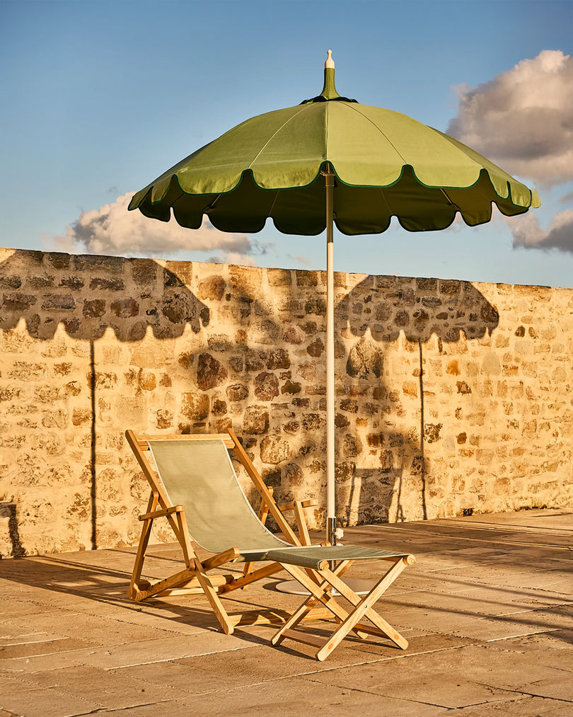


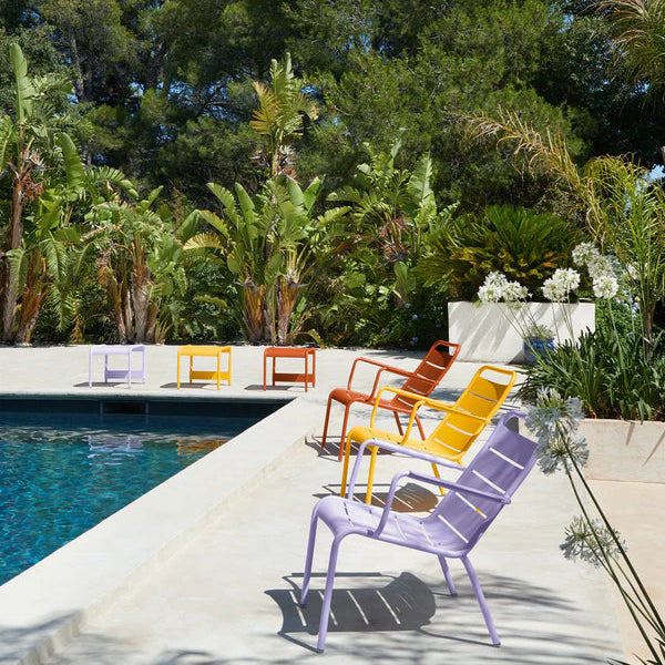


Latte Beige is the kind of colour that doesn’t announce itself — it glows, That’s why it’s the perfect addition to our colourful outdoor furniture collection. A soft, yellow under-toned beige that brings more tenderness than white, without the heaviness of a true neutral. Think sun-warmed limestone or the gentlest wash of morning light across plaster. In design terms, Latte Beige is a “bridge tone”: it connects palettes rather than competing with them, making it an effortless new anchor for outdoor (and indoor) spaces.
Why Latte Beige works so beautifully
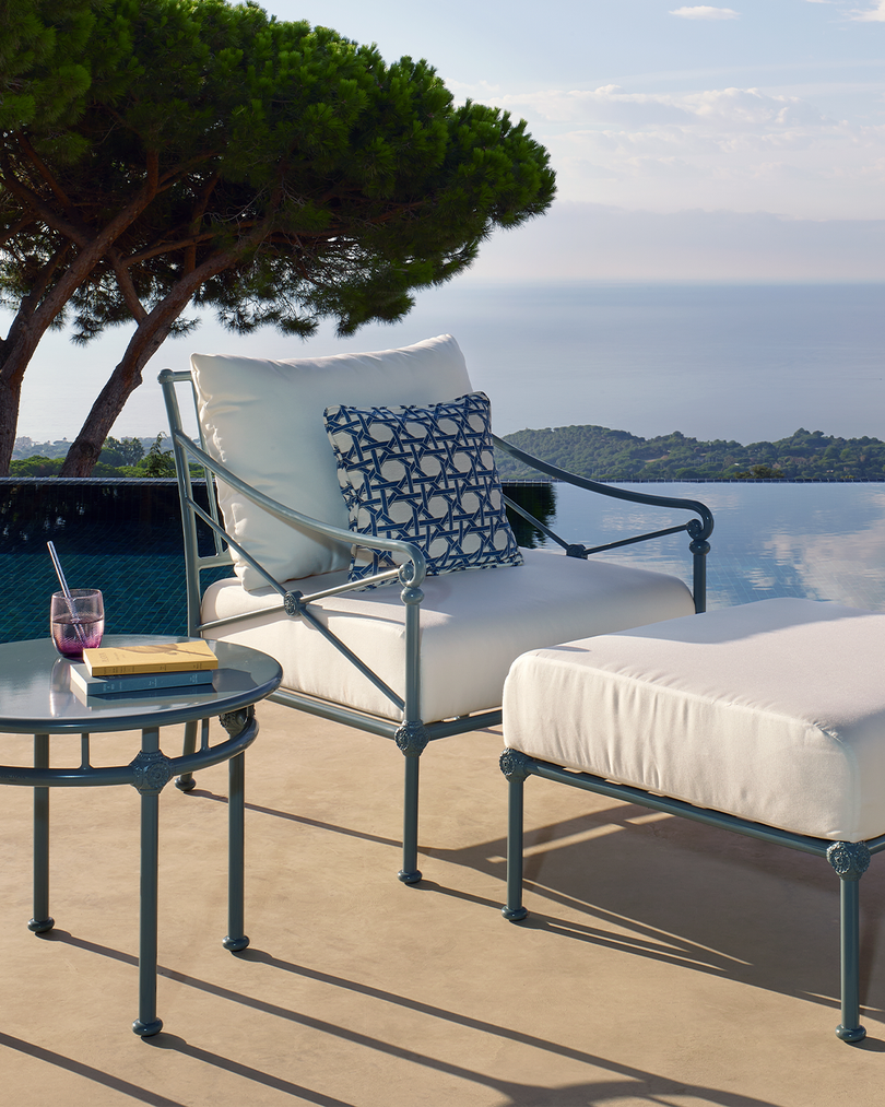
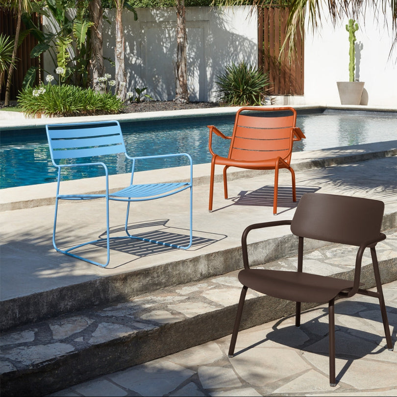
Where crisp whites can feel stark in full sun, Latte Beige behaves like a diffuser. It softens contrast, reduces glare, and adds that barely-there warmth that makes a setting feel lived in, not staged. It’s especially powerful with powder-coated metal furniture because it elevates the sculptural lines: shadows become part of the design, and silhouettes feel intentionally architectural.
 Use it as a light neutral in a layered palette
Latte Beige pairs well when you use it as a base palette, adding texture and tonal variation around it.
Pair with:
- Textiles: ecru linen, natural canvas, boucle-look outdoor fabrics, complimentary cushions
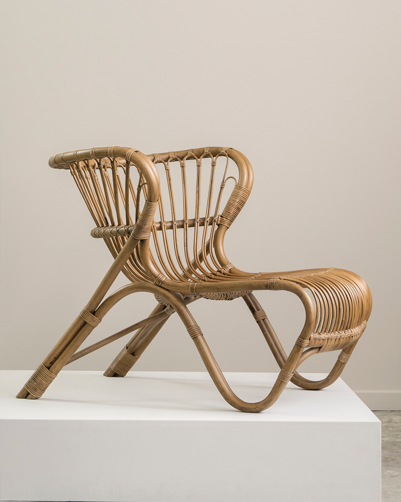
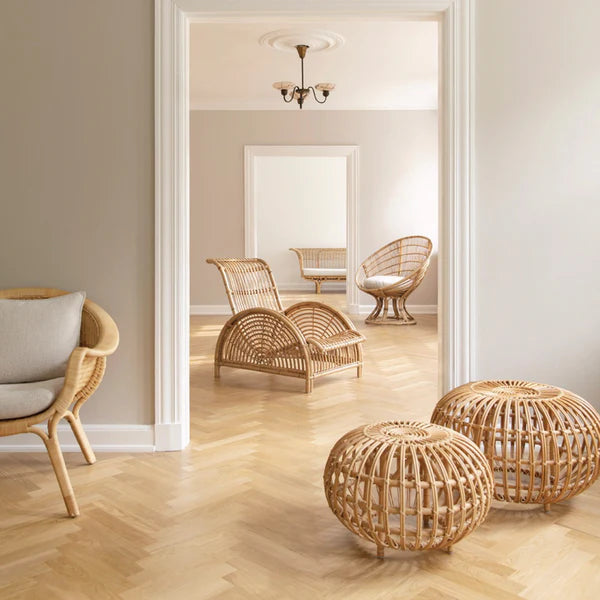
- Materials: travertine, teak, rattan, terracotta, pale oak, stone
- Greenery: olive trees, citrus, rosemary, soft grasses — anything with grey-green nuance looks instantly elevated or a pop of colour from a flowering potted plant
The Principle at play when layering a light neutral palette is tonal harmony — when colour is quiet, texture and nature becomes the drama.

 Because Latte Beige is subtle, it loves a counterpart with depth. Bring in a darker or bolder element to sharpen the composition or provide a grounding moment to colourful spaces.
- Contrast the glow of outdoor lighting and Latte Beige with stronger darker tones like charcoals, deeper neutrals and black
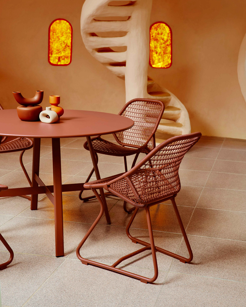
- Add a piece of Latte Beige to your multi coloured set ups to add a grounding moment and a break for the eye in amongst pop’s of personality
The principle at play when layering Latte Beige with darker tones and bolder colours adds value contrast — It gives furniture presence and helps lead the eye to your space’s focal point.
Pairing Latte Beige with Fermob’s colour spectrum (don’t overthink it)
With Fermob’s extensive palette, Latte Beige can act like a curator — pulling tones into a coherent collection rather than a mixed bag. It’s the perfect light neutral to pair perfectly with everything. Here are some Pinterest-approved palettes:

Pair Latte Beige with other soft, muted tones like Fermob’s: Tonka, Nutmeg or Clay Grey, to create a clean look. You can also add in greens like Cactus, Rosemary, Willow Green or Pesto to add a muted pop to the neutral tones. This palette creates an Architectural-minimal mood; drawing from surrounding materiality and nature - Feeling: quiet, sunlit, and timeless.

Latte Beige is an ideal buffer between pastels — it stops trends from feeling sickeningly suite working to ground colour in a room. Use it to ground Fermob’s colours like Marshmallow, Ice Mint, Frosted Lemon and Maya Blue, so the result feel trendy yet timeless.

Burgundy and Blue has been a colour combination filling our feed, Latte Beige is the ideal addition to this old duo bringing some brightness back to balance spaces — Try a combo of Fermob’s Black Cherry, Maya Blue and Latte Beige to nail this trend.
The takeaway
Latte Beige isn’t just a new colour — it’s a new mood. A warm whisper that makes everything around it feel more intentional: brighter colours look fresher, darker tones look richer, and natural textures look more tactile. If you’ve ever loved the simplicity of white but wished it felt a little more inviting, Latte Beige is your answer — sunlight, softened into colour.